Portfolio site up
I finally have a decent online portfolio. Please feel free to check it out at dallasreedy.com and give me some feedback.
Thanks, party people.
Dallas
posted by Dallas @ 2:45 AM
0 comments
![]()
☆ episode 73's alter design ego. this blog will be full of my own personal design insights, pet-peeves, ideas, discoverings, accomplishments and rants. if this kind of thing isn't up your alley, please follow all exit signs and have a nice day.
I finally have a decent online portfolio. Please feel free to check it out at dallasreedy.com and give me some feedback.
posted by Dallas @ 2:45 AM
0 comments
![]()
posted by Dallas @ 1:45 AM
1 comments
![]()
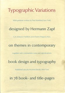 Typographic Variations: on themes in contemporary book design and typography in 78 book- and title-pages
 all intermingle to present to the viewer an excerpt of what could easily have been a design masterpiece. While a lot of the book is in Zapf's native German tongue, there are some designs in the book that are in English, French and some that are in Latin (and probably some other languages that my feeble American brain just skips over).
posted by Dallas @ 2:38 PM
0 comments
![]()
 So, another love of mine is typography. This book by Tara McLeod entitled, "Hot Acrobats Perform Cheese Fog Polka," looks like a real interesting view on old-school typography. Here is a synopsis of what the book is from the site where I found the picture:
With butcher paper, a swag of wooden type, and an 1832 Albion flat-bed press, Tara McLeod, owner-operator of The Pear Tree Press, printed 20 copies of Hot Acrobats. It was printed in sections on one continuous sheet and could well have been called: £63 NIGHT HAWK BAM! McLeod has some 25 publications to his credit over a period of ten years. He also prints limited edition books for the Holloway Press at the University of Auckland.
posted by Dallas @ 2:51 PM
0 comments
![]()
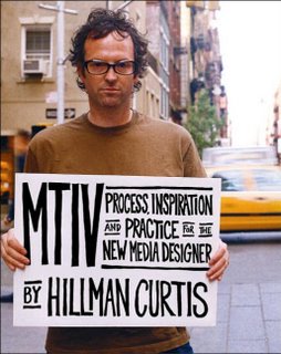 Currently I am reading this book by Hillman Curtis entitled, "MTIV: Process, Inspiration and Practice for the New Media Designer." The first part of it, Process, has been some of the most rewarding and informative reading that I have done in a long time. I'm not even a new media major. I'm a graphic design major. While this affords me a bit different mediums, the ideas are all the same. Everything he talks about with the process that they go through at hillmancurtis, inc. I am finding to be the most helpful knowledge to ever know. While this book is for a class and is a required and forced reading (two things that generally turn me off from reading altogether), I am finding that I'm picking it up whenever I have a spare moment just to read a page or two, or to look at some of the images and quotes that he considers his own inspiration. I'm not going to say that the man is a genius, don't get me wrong, but he is quite in tune with how the whole design process works, and how it works best for him. Another thing about the book that absolutely thrills me is the inclusion of large images, and sometimes several consecutive pages of just images, and when there is text, it is in such an nonintrusive and unimposing form that I am almost delighted to read it and I find myself turning each page with anticipation. So far, one of my favorite quotes from this book is this:
WHAT'S IN A WORD So what is inspiration? The Merriam-Webster dictionary has several definitoins, but two in particular really stand out for me: The action or power of moving the intellect or emotions. (and) The act of drawing in, specifically the drawing of air into the lungs.… Ideas/inspiration are all around us and, like air, we share them—breathing them into our bodies and returning them, changed, into the creative atmosphere.
posted by Dallas @ 12:12 AM
0 comments
![]()
posted by Dallas @ 7:43 PM
0 comments
![]()

posted by Dallas @ 1:45 PM
1 comments
![]()
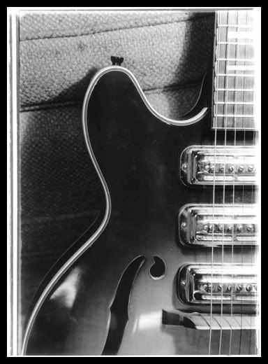
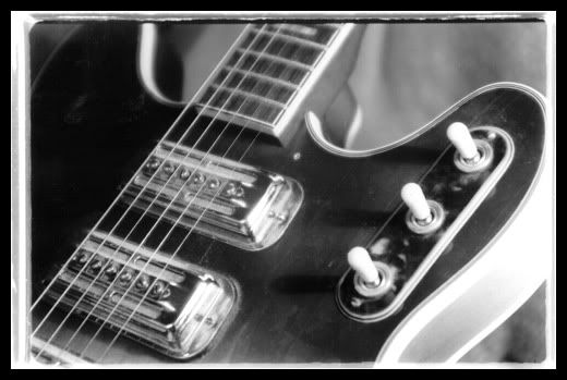
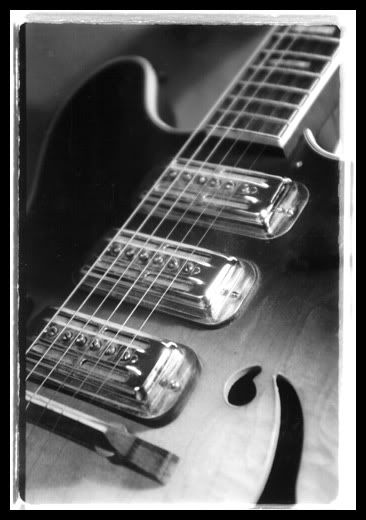
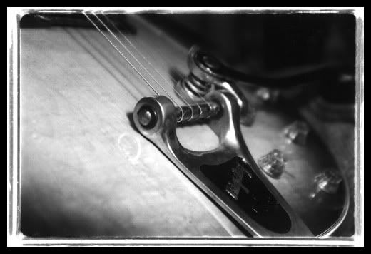
Here are some photographs I took of my guitar. These were part of my final display project for my Intro to Photography class at Walla Walla College.
posted by Dallas @ 1:25 AM
1 comments
![]()

First of all, is that a word? I don't know. Perhaps I made it up, perhaps not. If I did make it up, I think it should be a word. The Victorian era gave us so many examples of really awesome organic designs. Things that resemble parts of plants or vines, wallpaper that grows up the wall, fabrics with such intricate patterns that the eye dances with pleasure. I, for one, really enjoy the designs from this era in history. Personally I feel them coming back into style. A few weeks ago I stumbled upon a Victorian wallpaper site called Bradbury & Bradbury. This site has several samples of the wallpapers that they sell in various colors and styles. I totally love them. I downloaded as many of the samples as I could and I've been working on photoshopping (another made up term, perhaps?) them into useable Photoshop patterns for general use on posters, desktops and web site backgrounds. One such example is the background for my personal blog. Somebody please correct me if I'm wrong in this, but I think these things are really trendy right now. I mentioned the site and the available samples to one of my professors who was about to assign a Victorian poster assignment in one of her classes and I had the word trendy in the e-mail that I sent her. She replied by saying, "They may not be trendy, but they sure are timely." Are they really not trendy? I love them. Am I out of the trend? (wouldn't be the first time!)


posted by Dallas @ 12:03 AM
1 comments
![]()

I don't know if you're like me at all (you probably aren't), but I really love unique ampersands. Adobe Garamond Pro Italic has one of the best ampersands of all time. It's so stylish, so classic, so beautiful. You may not get it, but that's okay. I'm not really in this business to please anybody or anything except my own need to create. Lately I've been finding myself doodling ampersand variations on all of my class notes. I've also started trying to use them more often in my daily hand-writing rather than using the backwards "3" with the lines coming out of the top and bottom or the generic "+." It's just so much more fun to make all kinds of swoops and curls and have it mean "and." Also, along with my sudden interest in the form of the ampersand came an interest in its history. For me this is a big deal. I hate history. Despise it. I can't stand it. Actually having an urge to know something from the past and researching it on my own time is a really big deal to me. I went to Adobe's site and looked it up. Apparently, the actual form of the ampersand as we know it dates back to like 79 A.D. as some Pompeiian graffiti. The ampersand character is derived from the ligature of et, which is the Latin word for "and". The word ampersand is a corruption of the phrase and per se and, which literally means "(the character) & is itself (the word) and." So, now you know; in case you go to a school like mine where they really don't teach you all that much in your typography class because it's a freshmen level class and is only one quarter long.
posted by Dallas @ 8:53 PM
0 comments
![]()

Portland born and raised. Walla Walla pays and plays. Ida-Haven a few more days.
