a treasure in our humble library
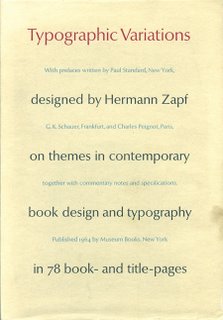 Typographic Variations: on themes in contemporary book design and typography in 78 book- and title-pages
With prefaces written by Paul Standard, New York, G. K. Schauer, Frankfurt, and Charles Peignot, Paris, together with commentary notes and specifications.
Designed by Hermann Zapf
Published 1964 by Museum Books, New York
This book is amazing. It is so simple and so elegant in its design. Each "page" is actually an entire spread, of which only the right-hand side is used. All of the page numbers are embossed into the page. Each page's design has an embossed border around it so each and every page is about the design that is showcased on that page and NOTHING else. It is, in its entirety, elegant. It is completely simple. It is the epitome of timelessness and absolutely gorgeous design. Take this image of page number 25, for instance. I completely does the actual page no justice at all, but even as it is on the screen, it is seemingly way ahead of its time. The simple distress on the thick border, the ever-classic, sans serif typeface, and the excellent use of design rules-of-thumb (the positioning on the page, the contrast amongst colors and fonts, the continuity with the border pieces, etc.)
 all intermingle to present to the viewer an excerpt of what could easily have been a design masterpiece. While a lot of the book is in Zapf's native German tongue, there are some designs in the book that are in English, French and some that are in Latin (and probably some other languages that my feeble American brain just skips over).
I didn't manage to snap an image of it, but I just came across a page in the book (67) that has contemporary looking illustrations of a hawk with a turtle in its talons and then the words »Les Fables de Jean de la Fontaine« (the European style quotes [»«] are used throughout the book, so I thought I'd just pay them tribute here) and below that it has another illustration, this time of two roosters in a cock fight. Then below that it finishes off with the credits: »Illustrées par Fritz Kredel.« All-in-all, I consider this book an amazing source of inspiration from the past. The elegance, the simplicity, and the overall design is just so incredible that I have literally been sitting here for an hour just looking at pages 1—68. I still have 10 more pages to go. Whoever thought that such a simple book from the 60s could prove to be so powerful? Hermann Zapf, that's who!
By the way, I looked up this book on Amazon.com, and there's apparently only ONE on there for sale and it's currently going for $399.99, so...I really feel like I have a sacred, design treasure in my hands. If you ever get a chance to see this book, I would highly recommend at least a quick sit-down and flip-through. It's totally worth your time!
posted by Dallas @ 2:38 PM
0 comments
![]()

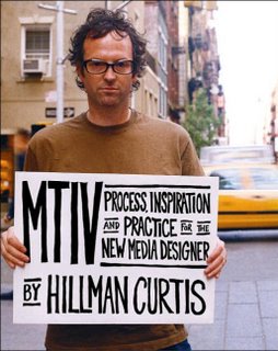 Currently I am reading this book by Hillman Curtis entitled, "MTIV: Process, Inspiration and Practice for the New Media Designer." The first part of it, Process, has been some of the most rewarding and informative reading that I have done in a long time. I'm not even a new media major. I'm a graphic design major. While this affords me a bit different mediums, the ideas are all the same. Everything he talks about with the process that they go through at
